Why does Koobiba look like that?
Why does Koobiba look the way it does?
All I knew when I started building it was that I wanted it to be simple and have a handle.
To make this a bit more concrete, I looked for inspiration online, in my two-year-old’s room and my own toy interactions from the past.
Devices from the past
This part is simple. I used to play with the Game Boy a lot, so it became an early reference point. It’s clearly not the same target group, but the form factor resonated.
A toddler’s room
This took a bit more time. I observed which toys had a shape or size close to what I had in mind, and how my toddler naturally picked them up and interacted with them. I wasn’t looking for the perfect match, but it gave me hints about what shapes and sizes small hands prefer to lift, hold, and explore.
Research
In my late undergrad years I came across Constructionism and the work of Seymour Papert. The idea is that kids learn by exploring and making sense of things with their hands. Instead of teaching them first and expecting them to follow, you give them an object that invites safe experimentation, and the learning emerges from doing. It resonated with me because I’ve liked tinkering with things since early childhood.
Practically, this means Koobiba should support progressive discovery and reward curiosity, where interaction grows with age:
- A 1-year-old mostly listens, with minimal intentional interaction
- At around 18 months, they start discovering a side button and simple cause and effect
- Later, they learn that the same device can do more, like navigating within a playlist through additional gestures
That idea influenced the enclosure shape too, aiming for something that does not feel overly busy from the outside. For example, there are no exposed LEDs, it’s all hidden under the surface.
Once that mental model was in place, I explored aesthetics further by researching audio devices and kid-friendly products over the last few decades to see what people loved, what aged well, and what fit my taste.
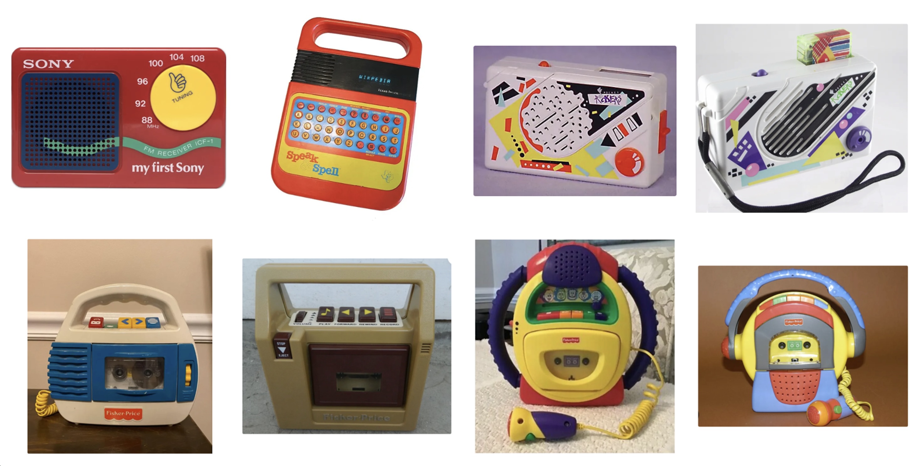
Looking for inspiration
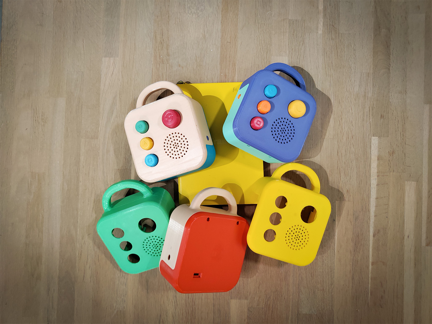
After several iterations, I landed on the enclosure design Koobiba largely has today.
From an idea to the physical object
Taking that rough idea and making a real object that needs to house electronics, mount buttons, a speaker, and a battery, all while handled or dropped by a toddler, was and still is a journey. As I hadn’t used CAD in a similar way before, there were many lessons and mistakes that contributed to how Koobiba now looks.
The main example is the asymmetrical sides.
For the very first iteration, Koobiba’s enclosure was split in three parts: front, middle (including the handle) and back.
However, this proved to be a catch-22 situation since both front and back sides had components mounted on them in a particular way. This meant that by the time I’d close one, I no longer had access to the other.
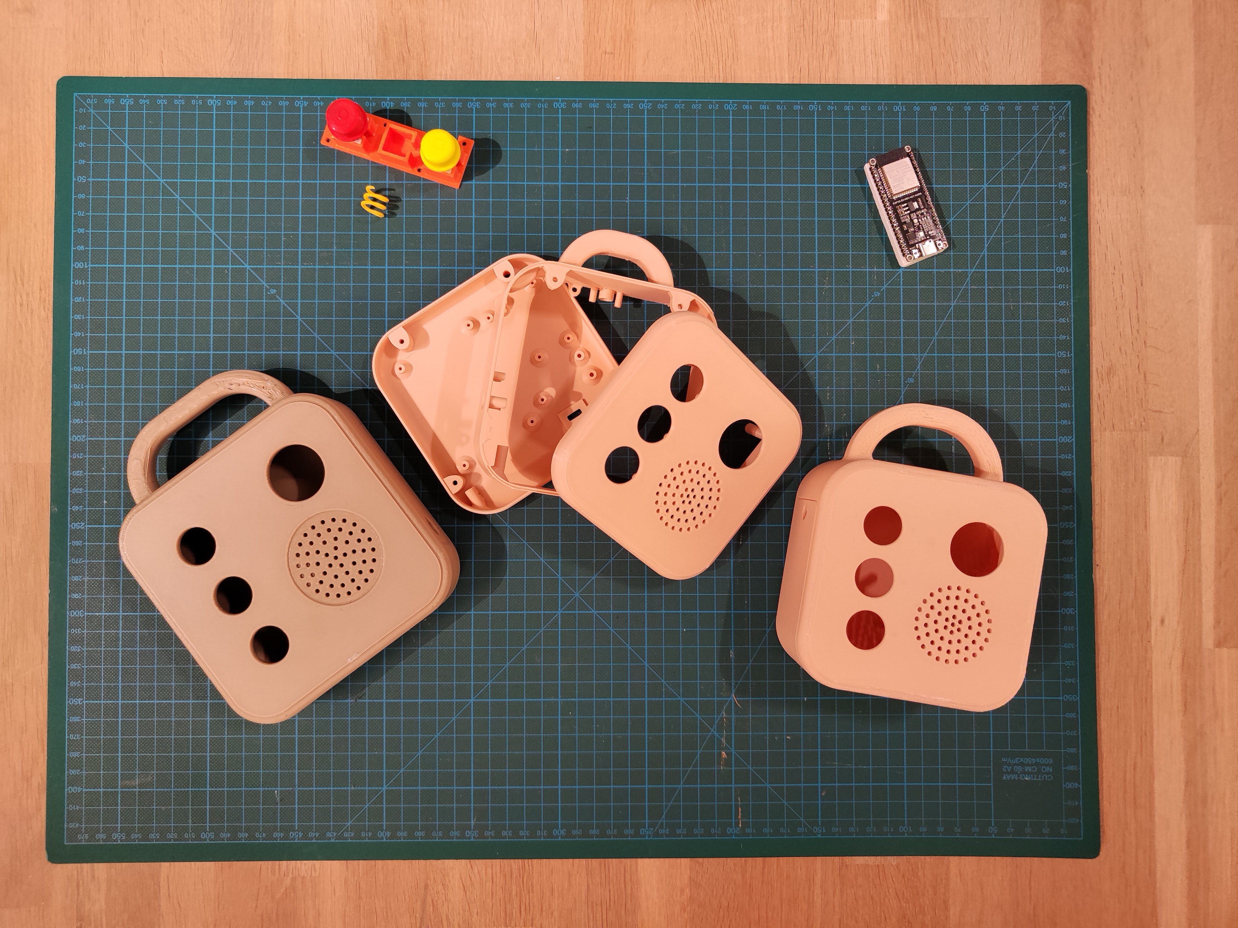
The three-piece split
Surely anyone who’s done something like that before would laugh at it, and I did too once I realised it after a 15-hour 3D print.
Fixing this mistake led to an unintended change that I actually liked.
To solve it, I moved from a three-part split to a two-part split. But given the position of the side buttons, that made it harder to reach the screws and fasteners.
So I introduced asymmetrical curves, and to make them feel more intentional, I changed the back color too (initially the whole enclosure was beige).
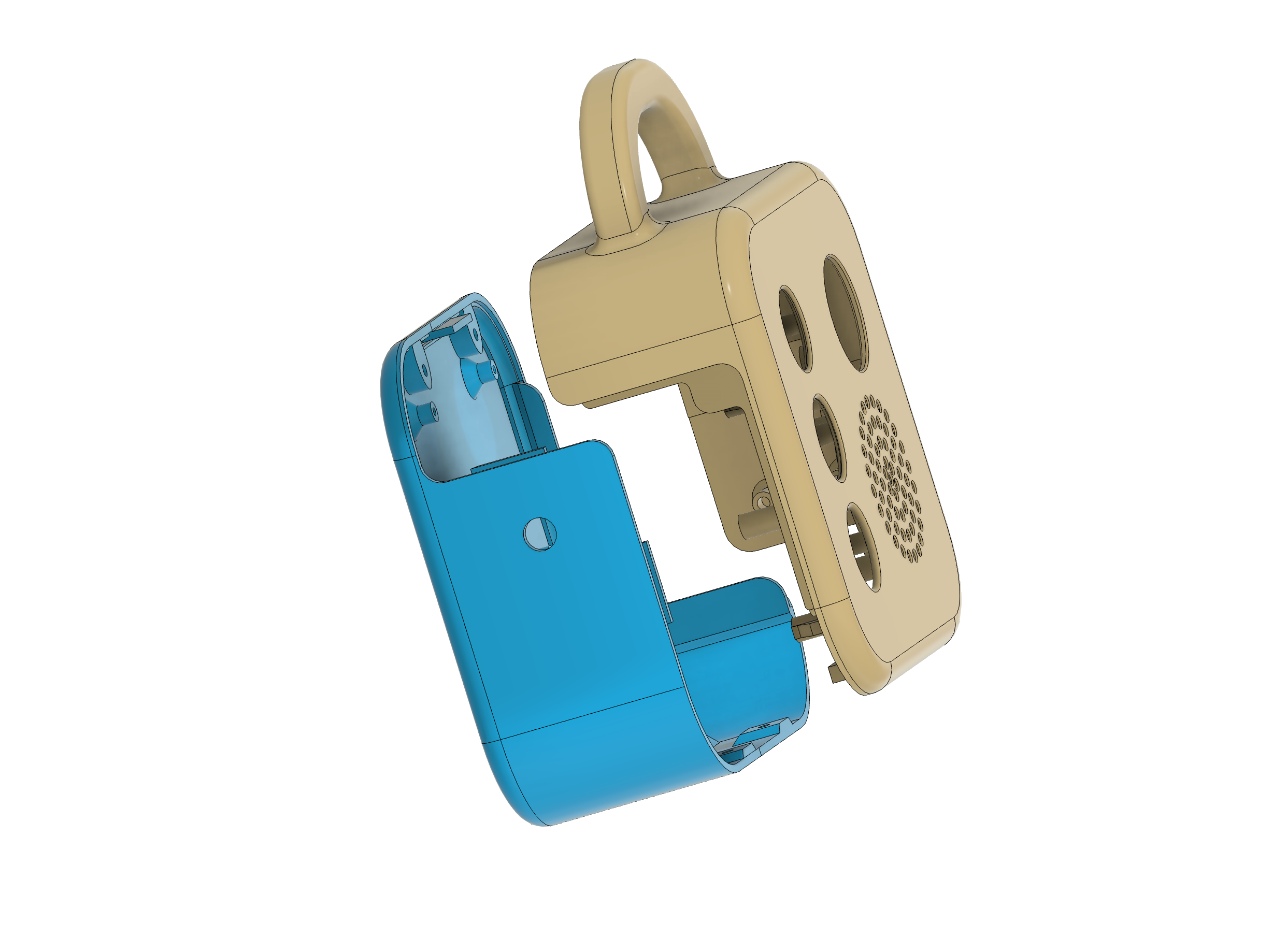
Moving to a 2-part enclosure
That’s, at a high level, how I moved from a concept to the real thing through exploration, iteration, plenty of learning and mistakes along the way.
Perhaps a future post can cover the user experience of interacting with the device and app, and how this came to be.